Dripping Springs Athletics
Challenge
A unique opportunity presented itself to rebrand the Dripping Springs Independent School District Athletics Program. The Dripping Springs High School Tiger were in need of not only an updated look for the school’s sports teams; but a unifying look to help stop to the endless iterations of tiger and paw imagery and graphics that had been diluting their image. expressed via a vibrant visual system—was needed to reignite that spark.
Strategy
Update Dripping Springs High School’s athletic logos and design secondary marks, wordmarks, and a custom font. Logos were adopted by the school’s men and women teams.
BRANDING
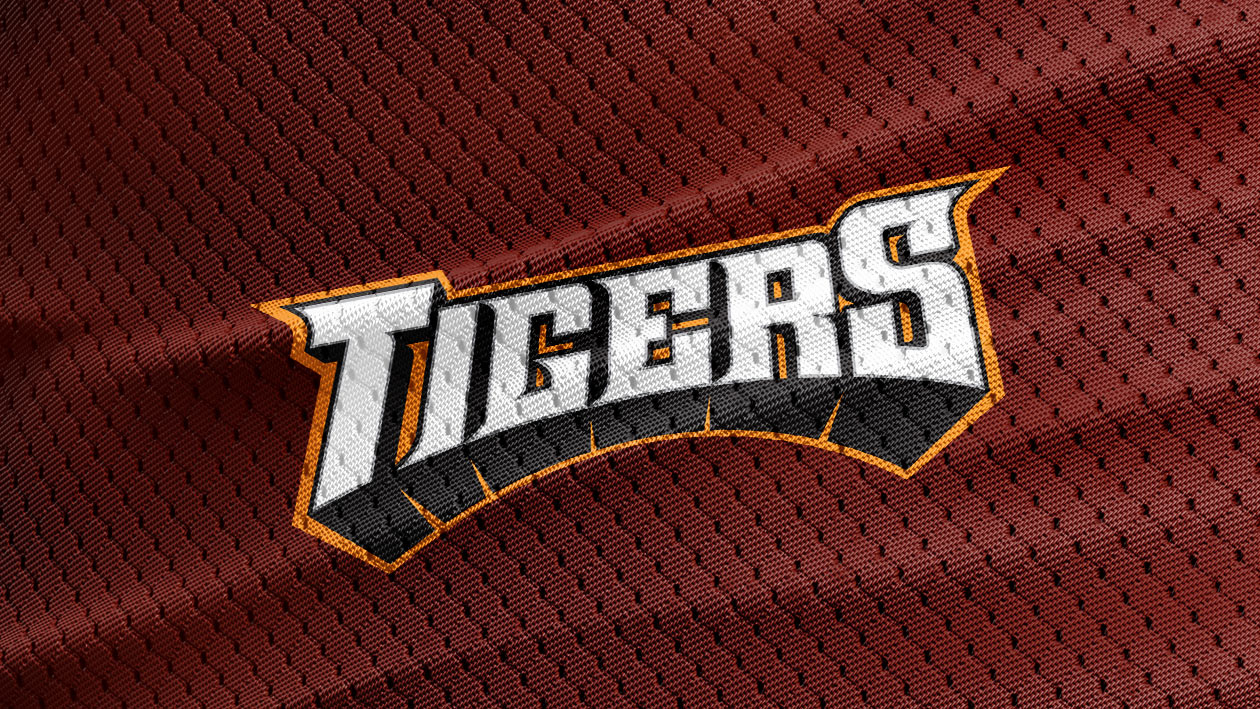
Universal Logo
Brand-to-User engagement is especially necessary in the sports world where fans live and die by their support. Apart from creating a bold & ambitious logo that highlights the tiger mascot, the rebrand is wonderfully aware of the versatility of contemporary sports consumption. The playfulness and fierce combination perfectly captures the approach to user engagements that make each sport so unique.
Moreover, it’s flexible enough to be able to take on corresponding clubs and finally achieving a unified look and feel for the entire athletics program and paving the way for athletes for decades to come.
Uniforms
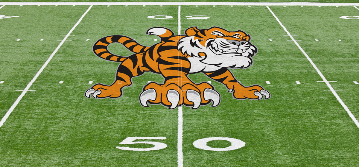
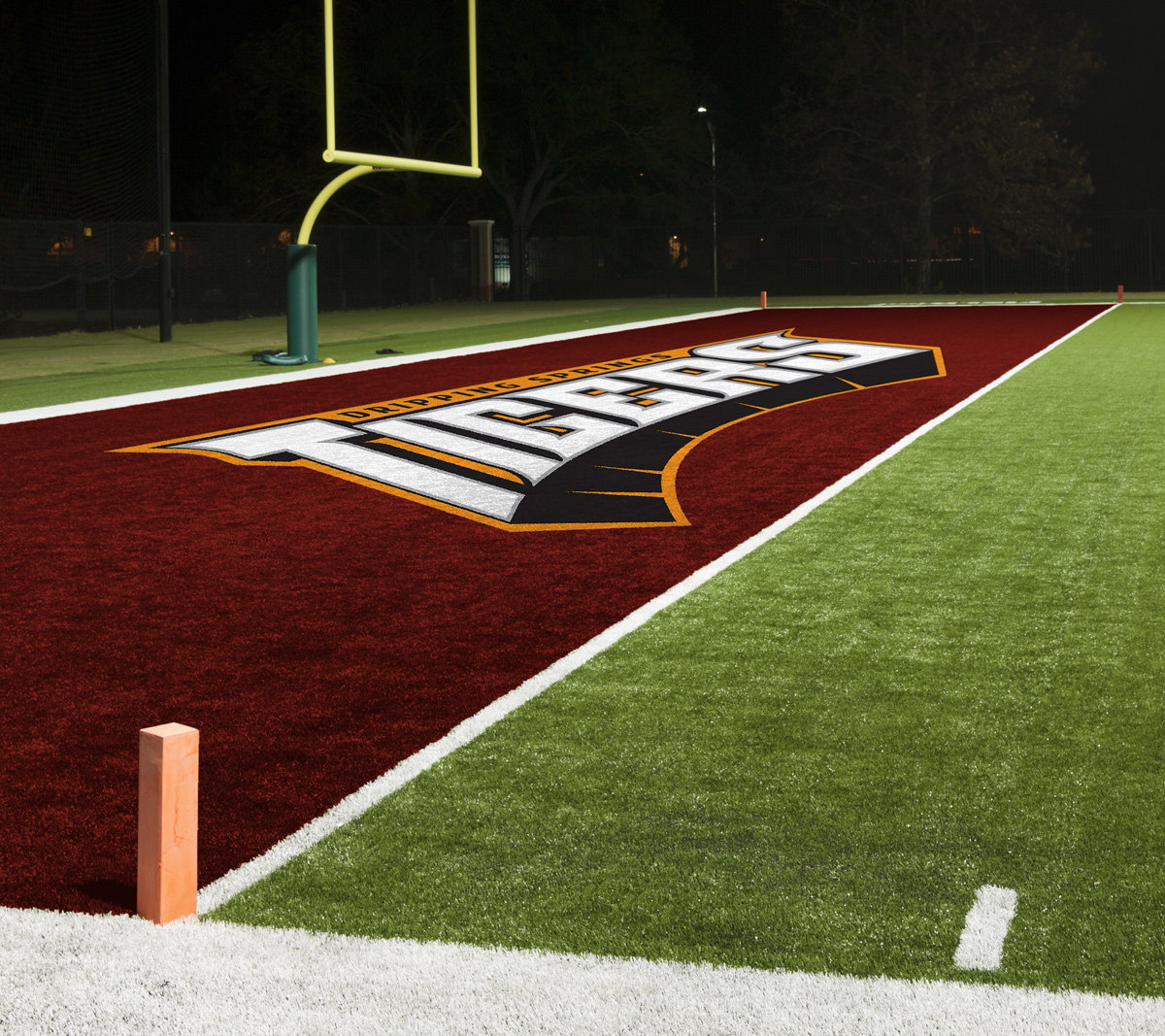
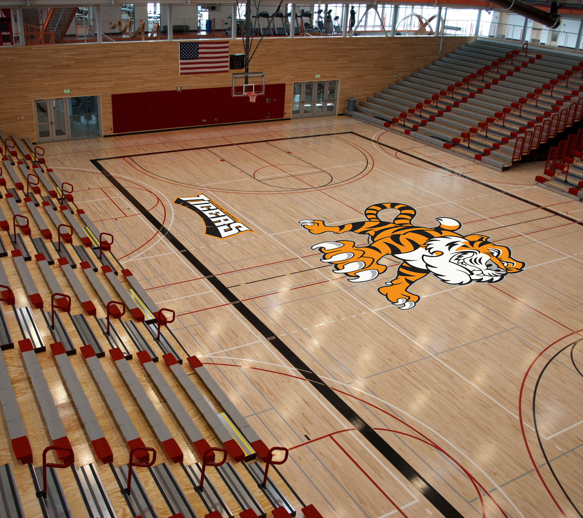
By the time preparation for the new football season rolled around in early 2017, I had established a look the Tiger community could enthusiastically support. Keyed around the “Logo Type”, “Full Body” tiger, and the “Tiger Head”, the new identity embraced a bold, more energetic look. More importantly, with the collegiate look desired by the booster club, the new identity immediately began to create a buzz in the community.
With any good brand, the opportunity for growth is abundant. Once the new Tiger brand was unveiled, plans were established to adapt the look to a variety of different uses. Within the first year, the booster club had commissioned multiple apparel item designs, vehicle decals, marketing materials, and a new website. Other organizations on campus immediately embraced the new design and commissioned work for themselves. And the fans bought everything on the shelves. The Tiger identity was a hit!