U.S. Government Accountability Office
UX Designer
Tools
Sketch
InVision
Challenge
-
Redesign the GAO website, developing an informed strategy for page layouts and navigation
-
Provide information that is easy to find and is relevant to our user’s needs by implementing taxonomy consistently through out the site
-
Move to a more modern content management system (CMS) and reorganize the information with a structured hierarchy and navigation for key pages and information.
-
Integrating engaging content where it is relevant, including: Flickr gallery, Integrated graphics, Video, Blog
Deliverables
Content, Resources, Accessible Website Built on Drupal 8
OVERVIEW
Introduction
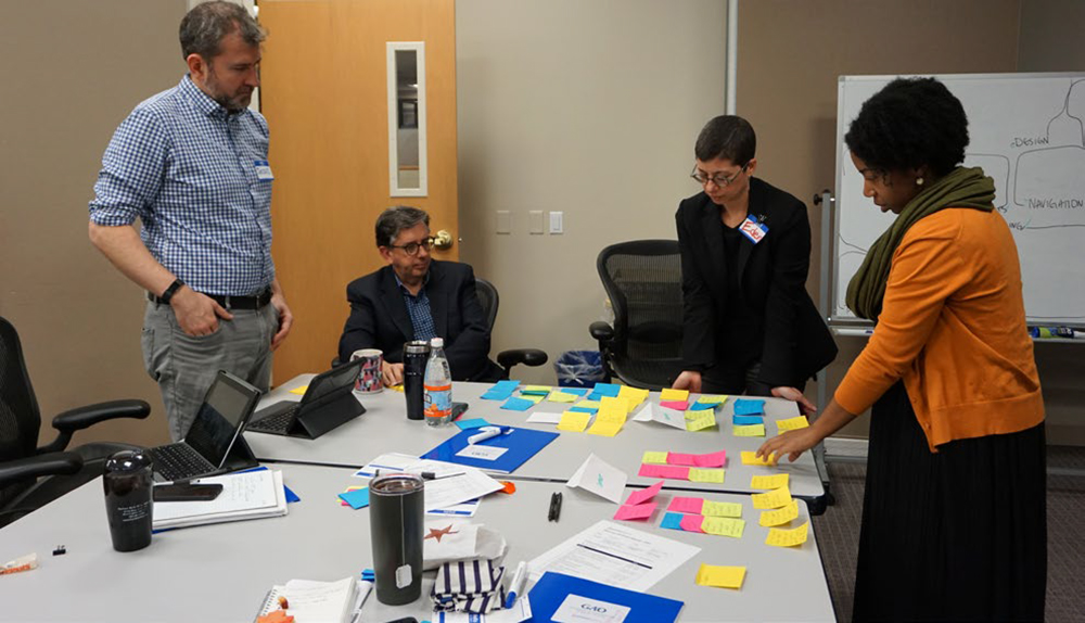
A Discovery Workshop was facilitated with GAO. Over the course of two days, we met with the key team members from GAO to discuss a redesign of their website GAO.gov. The facilitated workshop employed Human-Centered design methods to help build empathy for prospective users and better understand their goals and needs so we can build a solution that is easy to use and maintain for all users of the site.
Objective
The strategic objective for this initiative with GAO is to make the website mobile responsive, to create a consistent user interface and navigation menus with information architecture that encourages users to stay on the site and engage with GAO content while providing a modern easy-to-use CMS.
Solution
Working collaboratively with GAO, we defined the organization’s biggest challenges with their existing website and discovered their goals and needs for the development of their new site. We also discussed the needs of the user groups the website serves to ensure the site meets their needs as well.
Success
The key to success for this solution is to understand GAO’s primary user groups and provide them with content and resources organized in a way that best meets their needs, build the site on Drupal 8 for a robust and easy-to-maintain CMS, while ensuring the site’s content is accessible from any device.
DISCOVER
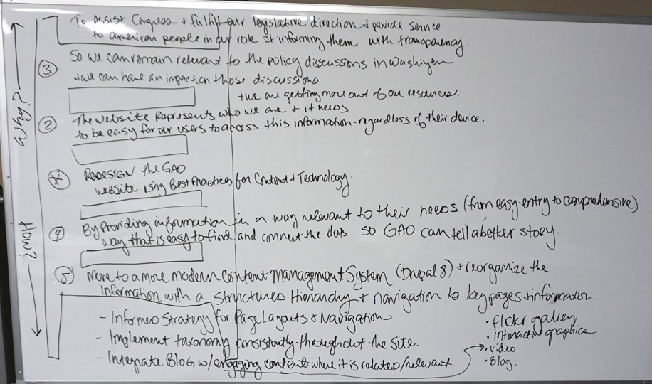
Abstract Laddering
Abstraction Laddering is a technique for framing problem statements in higher (or lower) levels of abstraction.
In order to understand the visionary and tactical purposes of GAO’s goals for redesigning their website, we participated in this group exercise to help us widen the scope as we moved up the ladder asking “why” and got more concrete as we moved down the ladder, answering “how”.
Here is what we discovered in our meeting with the GAO group:
We want to redesign the GAO website using best practices for content and technology.
The website represents who we are and it needs to be easy for our users to access the information we provide — regardless of the device they are on so they can get more out of our resources.
We need to do this to remain relevant and so that we can have an impact on policy discussions in Washington, D.C. We do this to assist Congress and to fulfill our legislative direction and provide service to the American people in our role of informing them with transparency.
We will do this by providing information that is easy to find and is relevant to our user’s needs (from easy-entry to comprehensive), that also better connects the dots with a better GAO story.
We will move to a more modern content management system (CMS) and reorganize the information with a structured hierarchy and navigation for key pages and information.
Website Audit
As the GAO team led the walk-through of their existing website, we discussed some challenges and opportunities for improvement.
Starting on the home page, we discussed that the GAO team felt the home page was too complex and would like to see it simplified, while still serving relevant content to its users.
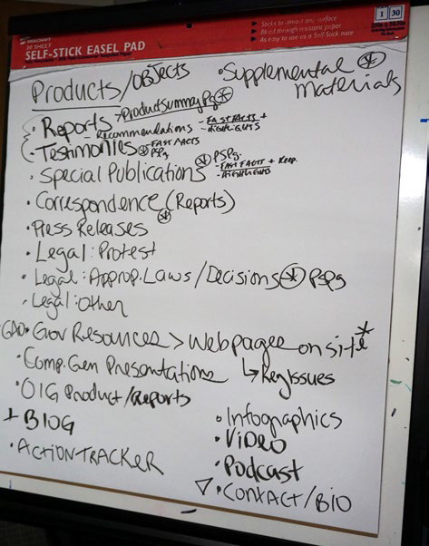
We also discovered most users do not arrive at the homepage to begin their browsing the GAO website and instead arrive on a specific landing page from a Google search and continue on to locate a report. While asessing the interior pages and the functionality of the current website we discovered that many of the pages are search results, lists, and categories of resources. These resources, called “Products” by GAO are scattered throughout the site and are given a “Product Summary Page” that provides a description of the resource with the link to view or download it.
We began to uncover the varying “product” types within the GAO resources and listed them to understand the types of resources available on the site and how the site is organized around these products.
Analogous Inspiration
After reviewing the current GAO website, we discussed the desired brand system for GAO, along with some examples of web sites the team members admired or felt had something we could refer to that they liked while redesigning the GAO site.
GAO decided that they would like to use the U.S. Web Design System as a baseline for their new site design. This Design System has been established as a standard for the Federal Government. GAO wishes to start with this design system, but also expressed a desire to make GAO have a distinct look and feel.
- Has fewer topics than GAO
- Homepage has featured & major reports
- Co-located under topic
- Also organized by year
- Relevant items in right column
- Nice mix of graphics and imagery
- Good branding
- Nice organization of topics on home page with iconography
- Nice mix of image and text on home page
- Most popular visualizations
- Sharing / embed of articles
- Organized well by topic — however all topics appear in top navigation menu
- Likes look and feel, but too heavy on imagery
- Homepage has nice layout
- Easy to find info, likes the search featured
Stakeholder Mapping
As a group, we discussed the network of people involved and impacted by the GAO Website to better understand their relationship to each other, the project, and the type of information they are interested in viewing on the GAO website.
After uncovering the variety of user types for the website, we discussed prioritizing these groups so that we can discover our primary target groups and can better understand how to arrange content and navigation.
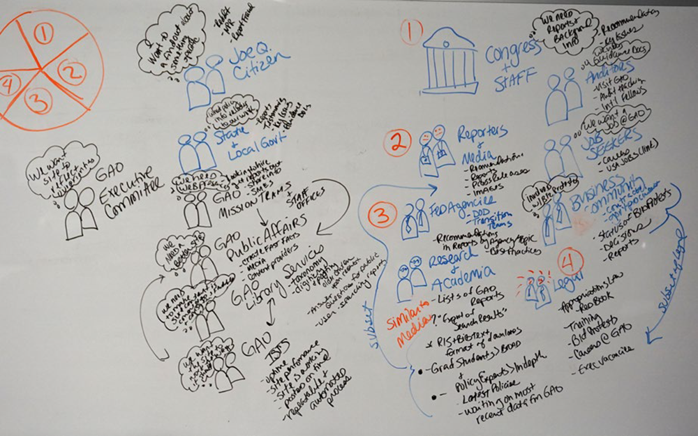
We discovered and ranked our user groups into the following priorities. It was determined that Research & Academia overlapped with Reporters & Media, so we collapsed these two user groups into the secondary audience.
Primary Audience
Congress & Staff
“We need reports and background information”
- Recommendations
- Key Issues
Secondary Audience – Part 1
Reporters & Media
- Recommendations
- Reports
- Press Releases
- Images
Secondary Audience – Part 2
Research & Academia
- List of GAO reports
- Export of search results
- RIS & BIB text format of downloads
- Latest policies
- Waiting on most recent data from GAO
Tertiary Audience
Federal Agencies & Legal
- Recommendations in Reports by Agency/Topic
- Best Practices
- Training
- Bid Protests
- Careers @ GAO
- Executive Vacancies
DIFINE
Personas
Persona profiling is a characterization of target audience members to summarize their goals & needs. Through this exercise to better understand our target audiences, we create empathy to influence our design and content architecture.

Rose
Age: 45
Gender: Female
Occupation: Legislative Assistant
- Consumes news/info
- Fast paced/meetings
- Research
“I need to move legislation and clear, nonpartisan points helps me make my case.”
- Getting re-elected
- Good media coverage
- Getting legislation passed
- Clear bottom-line info/mobile friendly
- Graphics/Data stories
- Ability to dive deep/Find experts
– Non-partisan research
– Bottom-line info
- Ambitious / further career
- Become SME
- Make their Rep. look good
Mobile importance: 10 of 10
Needs Chronological Info to Topical: 3 of 10
Browsing vs. Data-driven: 3 of 10

Steve
Age: 47
Gender: Male
Occupation: Reporter for Air Force Times
- Senior Reporter
- Writes web stories daily
- Publish bi-weekly
“Give it to me straight.”
- Be the 1st person to publish info
- Have new content everyday
- Get everything they need for a story in one place: images & media
- Social media on his platforms
- Data that is exclusive
- An expert to interview
- Win Awards
- Expert on his beat
- Meet his deadlines and go home to family
Mobile importance: 6.5 of 10
Needs Chronological Info to Topical: 1 of 10
Browsing vs. Data-driven: 2 of 10

Johnny
Age: 37
Gender: Male
Occupation: Project Manager at FEMA
- Home brewer
- Disaster recovery and resilience
“I just want to get the info to get my job done.”
- Get his recommendations off of GAO recommendations list
- What info has GAO published about his agency in past
- Looking for best practices
- Effective search and navigation
- Find people at GAO
- Wants program to be successful and effective
- Very interested in external perception of program
- Advance his career at FEMA or private sector
Mobile importance: 2 of 10
Needs Chronological Info to Topical: 9 of 10
Browsing vs. Data-driven: 8 of 10

Gabe
Age: 32
Gender: Male
Occupation: Consultant
- Files bid protests on behalf of government contract/employ
- Works at desk
- Guitar/band
“I make the money for the boss.”
- Easily file protest
- Get protests sustained
- Wants status of his protests
- An easy way to research protests — past and present
- Easy way to file and get status
- Career, stability, and success
- Personal satisfaction in “fake” lawyering
- To get out of this line of work
- Killer riffs/Guitar playing
Mobile importance: 1 of 10
Needs Chronological Info to Topical: 6-8 of 10
Browsing vs. Data-driven: 10 of 10

Jackie
Age: 28
Gender: Female
Occupation: Health Policy Expert
- Works at Think Tank
- Conferences / Assoc. Meetings
- At Desk
“I need to know in case I am asked.”
- Get publishers
- Stay informed on field
- Build on expertise
- Broad range of reports collected into topics
- Latest news
- Access to data
- Drive policy change and legislation
- “Set the agenda” / Public conversation
- Be a future executive branch policy advisor / manager
Mobile importance: 3 of 10
Needs Chronological Info to Topical: 5 of 10
Browsing vs. Data-driven: 10 of 10
User Journey
For the last exercise on Day 1, we mapped the user journey of each of our Personas to see how they might experience with web system of GAO to learn about any similarities and differences between the user groups. Here is what we discovered:
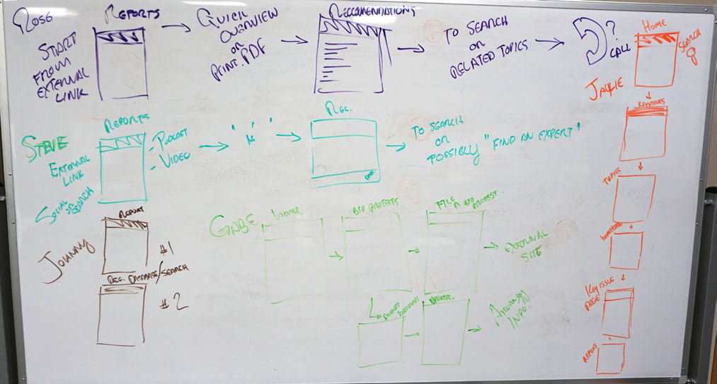
Rose (Congress & Staff)
- Starts with an external link
- Arrives at Reports
- Reads the overview or prints the report PDF
- Process to Recommendations
- Searches on Related Topics
- May make a phone call to GAO for more info
Steve (Reporters & Media)
- Starts with an external link from a social media site or external search such as Google
- Arrives on Report Page views podcast or video
- Reads the overview or prints the report PDF
- Process to Recommendations
- Searches to possibly “Find an Expert”
Johnny (Federal Agency)
- Views the Report Page
- References the database/search
Gabe (Legal)
- Starts on Home Page
- Visits Bid Protests
- Files a Bid Protest
- Link goes to an External Site
- Visits Dockets & Decisions
- Reviews Updates
- Finds Attorney Information
Jackie (Research)
- Starts with a search on the Home Page
- Visits Key Issues
- Selects a topic: Healthcare
- Visits Healthcare Key Issue Page
- Looks at Report from topic
Site Analysis - Rose, Bud, Thorn Method
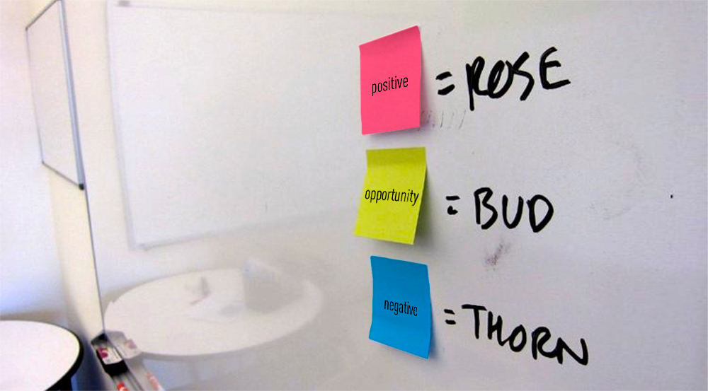
Rose, Thorn, Bud is a way of scoping problems and solutions by revealing focus areas.
In order to identify issues and problems, we use this method to individually transcribe thoughts of the current website into categories as being positive, negative, or a potential opportunity for GAO. Here is the input the team provided:
Rose - This is working
- Site serves many audiences
- Hill staff and journalists love fast facts
- Content is good
- Transparent and provide free access to content
- Performance: uptime
- High customer satisfaction
- What’s new is at the top of the homepage
- About Us page (recently revised)
- Have processes that support timely posting of content to the site
- Most of the pages are structured in the site without orphans
- Contact info for issues
- Smart and dedicated staff
Bud - This is an opportunity
- More modern design
- Layout improvements for the way content is placed
- Better navigation
- Better linkage between related content
- Improve search functionality
- Taxonomy can help organize content
- Branding opportunities
- Consistent icons
- Help us tell stories more easily
- Email sign up can be more prominent
- Better showcase when we have an event
- Better SEO
- Search function that focuses on search
- Find the history of GAO and publications
- Biblio drupal module
- Better leveraging of multimedia
- Explain who we are
- Better integration with HTML reports
- Provide director bios that automatically link to relevant topics and reports
- Ability to navigate laterally: related content presented
- Connect the decision status from docket with decision that was issued
- Users can subscribe to bid protest status and get notification updates
- Mobile responsiveness
- ADA compliance
Thorn - This is broken
- Home page too busy
- Outdated design
- Needs better nav and breadcrumbs
- No clear path to the site or related reports
- No explanation of different products/reports
- Poor search
- Taxonomy not utilized effectively to surface related content
- Difficult to make changes
- Too many steps to hand off content
- Unrelated thumbnail images with reports
- Brand is not evident on the site
- Topical information (key issues) is driven more by mission teams than what users want
- Confusing terms and jargon
- Presentation of the content is bad
- Not enough plain language
- Actions and recommendations are in two different systems
- No way to export search results
- Lacking connection between digital footprints
- Lack of standards adhered to by all carousels are hard to absorb
- Not mobile responsive
- 5 different taxonomy systems
Site Analysis - Affinity Clustering
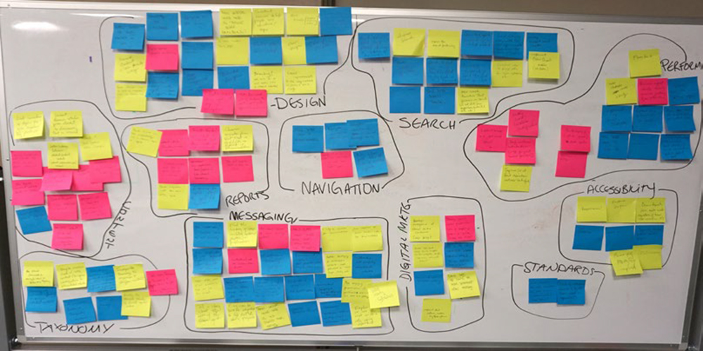
Affinity Clustering helps us to identify focus areas with visual cues on the size of the priority and the color indicating whether the category is currently positive, negative, or needs development.
Here is what we discovered by evaluating the individual statements from the previous exercise, Rose, Thorn, Bud, and grouping them by similarities so we can distinguish sentiment towards categories through color grouping that represent the positive (pink), negative (blue), or area of innovation (high presence of green notes).
Design
Overall, the design category has lots of opportunity for improvement (with a high presence of green notes), while the existing site design is seen as somewhat negative — though positives are that it serves diverse audiences, and does a good job of making most recent publications apparent and findable. The redesign is seen as an opportunity to improve branding, layout, content organization, visuals, and to present content in a user-friendly way.
Taxonomy
The team wants to further leverage this taxonomy throughout the site to increase the reach of the site’s content, better organize and surface content, and better navigate laterally throughout inner pages to related reports and content.
Considering the site has at least 5 different taxonomy systems, it may be important to consolidate these terms to better utilize taxonomy on the website.
Performance
Performance shows up as a balanced category with equal positive to negative notes. The performance is viewed as positive because overall customer satisfaction is pretty good with good uptime and site speed. However, the team would like to be able to make changes to the site more easily for site changes and content editing, new sections, and look and feel.
Standards
Appears to be a lack of standards for all teams to adhere to for process and like objects are not treated the same on the website in systems/workflows.
Accessibility
Site is not responsive and needs to provide a good experience regardless of which device is used to access it. Also, the site needs to become fully ADA/508 Compliant.
Search
Search is perceived as mostly negative, with only opportunities for improvement by finding ways to group resources by topic, collections, find PDFs, etc and utilizing taxonomy to improve overall site search for GAO.
Reports
Many positive attributes for reports were mentioned and would like to be emphasized in site redesign, including: Fast Facts, full PDF Report find-ability, report meta-data on product summary pages, contact info for directors and issue areas.
Improvements included:
- Some team members would like to see the report text available in the Product Summary page without having to open the PDF.
- Would like to see Director bios provide links to relevant topics and reports.
- Would like to see clearer navigation from Fast Facts to Highlights to Reports to Recommendations.
Content
Content at GAO is perceived as very strong and positive with how much information is available, and how long it has been published (since 1800s). There is also good implementation of multimedia and digital content. However, the team would like to see better connection between content topics and product content to give users a more clear idea of what all is available on the site. Team would also like to see notification of Bid Protest Status changes.
Messaging
Messaging is a huge category for GAO and is a prominent theme in our discussions. The site is seen as using confusing terms and jargon without enough focus on plain language. The GAO story is seen as complex and hard to tell. There is also no explanation of the different reports provided by GAO, their purpose, and where they come from.
Site does not provide a lot of background on GAO, it’s story, the mission, and the services they provide.
The positive for the Messaging category is that the About GAO does a much better job organizing content than previously.
Digital Marketing
The GAO team want to see the site do a better job of integrating and connecting existing GAO social media content and the blog. Also wants to see better SEO to better drive traffic to the site. Also, would like the new design to have a more prominent email sign up.
Requirement Statements
We asked the project team to review each category resulting from the Affinity Clustering exercise and write out a statement to summarize the need brought forth in the Rose, Thorn, Bud exercise for us to address in the new website build while focusing on solutions to the challenges brought forward, in order to plan for some of the opportunities noted.
In the next exercise, Bull’s Eye Prioritization, we mapped these statements to a prioritize their significance to GAO.
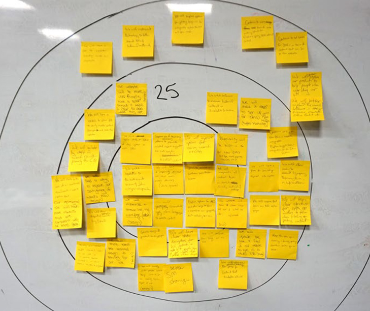
Bull's Eye Prioritization
The structure of the bull’s-eye supports categorization across each ring. This process helps to prioritize all of the Requirements Statements for new GAO.gov website redesign to show the most critical requirements, then important, then peripheral tasks as limit the quantity of statements within the three rings of the diagram.
Here are the requirement statements that were decided upon by the team to be the most critical and then ranked by lower priority based on a limited number of high priority items:
Critical Requirements
- Include default SEO & the option to edit SEO
- Improve the use of taxonomy software (Drupal) to populate related report suggestion and create navigation with related content
- Improve options for viewing search results
- Build accessibility best practices into new CMS with tags, transcripts, etc.
- Update to the most recent version of Solr with typo recognition
- Have a responsive site that it device-agnostic
- Strive to maintain or increase our customer satisfaction scores
- Incorporate all content types in search, including multimedia and blog
- Modernize and streamline the home page design
- Consistently apply plain language to the website content
- Explore options for API and other ways to share and visualize or proprietary data, including open recs
- Use visuals and content to make it clear “who GAO is” and “what we do”
- Integrate the blog
- Clearer status descriptions for bid protests and allows people to sign up for alerts when a status changes
- Consider redesign of Product Summary Pages
Important Requirements
- Continue to ensure historical content is available to users
- Make it easier to sign up for email subscriptions (Today’s Day Book & Reports)
- Continue working on New Blue and website integration
- Explore tagged XML and integration for future solutions
- Plan to provide topical information
- All users to search by agency, taxonomy term, or high-level topic
- Ensure there are no orphan pages
- Have a clear structure for OPA, ISTS, and others to follow when labeling and posting content
- Update the look and feel of the website to provide GAO with a visual identity
- Maintain the status quo and keep the site up and running with timely posting
- Redesign the Product Summary Page for content not available online
- Better Social Media sharing functionality
- Help visually guide users to where they want to go instead of making them figure it out
- Consider task-oriented design vs. browsing
- Make sure social media channels are more clear on our site
- Allow export of search results into Excel
- Redesign site with more visuals to create a consistent and better brand experience
- Improve spotlighting of what is new
- Include key staff with search results — primarily the CG
- Have a WCMS to allow PA to easily make content edits and updates to look and feel
- Provide a more user-friendly website with a better layout to make clear to users where they are within the site
Peripheral Requirements
- Explore options for getting buy-in to integrate action tracker and open recs
- Continue toward more formed web-writing standards and explore giving OPA editorial control
- Continue to set limits for SMEs in terms of content that can be on the website
- Better explain GAO Products to help people when searching the site
- Cut search drill-downs on GAO.gov Resources, memorandum, other products, etc.
- Have a plan to consider branding across all GAO web channels
- Implement technology to better search PDFs of historical material
Success Statements
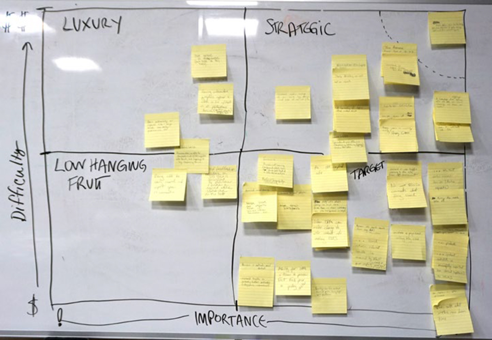
Individually, we asked what success of the GAO.gov website would look like and requested each team member to write down what success of the site looked like to them.
Then, as a group, we plotted these “success statements” on a matrix. We evaluated each statement whether it is very difficult to achieve and required lots of resources (e.g. money, time) to determine the level of effort it would require to implement. We grouped items together that were similar, visually revealing shared ideas among team members.
Importance / Difficulty Matrix
After all notes were plotted on the board, segments were drawn indicating whether the items are low-hanging fruit, low/luxury, target/ high value, or are strategic. Here is a summary of the results of this exercise:
Luxury
Items appearing in this section are costly and provide the lowest value and are seen as “luxury” items.
- Success is when the GAO brand is recognizable outside of D.C.
- Having interactive graphics that work inline with the text on all devices, such as Google Charts
- Success is when peers recognize our improved site with design awards, case studies, presentations, etc.
- Success is when a researcher is able to download a list of GAO reports into Excel and manage it by taxonomy terms.
Low-Hanging Fruit
These items are low difficulty and relatively lower importance, but should be considered for implementation if the help the overall success of the site:
- Being able to search and export open recommendations.
- Collect broad and specific feedback on the site that is consistent for problems and errors that will report where users are on the site.
Strategic
These statements are very important, but are the most difficult to achieve and to measure. These items should be evaluated to see how they would be accomplished. These items often require more discovery and research in order to achieve. These items include:
- An increase in media coverage of our work resulting from the design and ease-of-use of the site.
- Meets more Plain Language Act standards.
- Clearly describing our work and our reports.
- A hierarchy of topics that make sense.
- Consistent use of terms (taxonomy, labeling of pages) across the site.
- Increase in user time on the site.
- Decrease in bounce rate on the home page (currently 30 – 40%).
- Overall customer satisfaction and happy users.
- A homepage that clearly defines who we are, our visual identity, our tone, and our work.
The most important and the most difficult item to achieve was:
- Public Affairs team has the technology, tools and information to better manage SMEs and their content requests.
Target / High Value
High value items are ones that are very important and relatively easy to achieve.
- Success is when a user is not confused about how to find full text of a GAO Review Article (Design of the Product Summary Page).
- Have people share our reports on Social Media, email, etc.
- Success is when we have more email subscribers.
- When we have a 508 compliant site.
- When we no longer have ForeSee comment about fixing search.
- Success is an increase in organic user traffic to the site from SEO placement.
- The site is mobile-responsive and device agnostic.
- The site maintains great performance with no down time.
- Product meta-data is available and posted on time.
- Increase in page views and blog views.
- Increase in site search success (lower page depth).
- OPA would need to make changes to the web content without involving ISTS.
- Increase in multimedia views and downloads.
- Ability for OPA and teams to preview Fast Facts prior to posting.
- Branding to be clear and consistent across all public-facing digital and social platforms.
RECOMMENDATIONS
The GAO team discussed their current issues with the site and some of the complexities that have appeared on the site as they worked with their limited CMS over the years.
After our discussion and discovery with the GAO team, we provided some initial recommendations for consideration of the GAO website redesign.
- Recommended moving to a new CMS, such as Drupal 8, to better utilize the dynamic functionality and taxonomy features.
- Additional discovery and audit on the “Product” types on the GAO site, so that the functionality and design will help the user more easily locate the product they are looking for, and ensure a consistent taxonomy amongst the products.
- Add additional language on the home page about GAO, who we are and what we do to provide an instant and immediate reference for new users who arrive to the home page.
- Discovery revealed the need for a robust menu system with hover states and drop-down menus from the primary navigation.
- The GAO blog has separate taxonomy than the Products on the GAO site, and these need to contain consistent categorization when the blog is brought over to GAO – or the team could leave the blog seperate.
- Consider nesting existing taxonomy terms into high-level topics or category terms so that taxonomy is not a flat structure and they have parent categories for better content organization.
- The home page is viewed similar to a newspaper or publication site, we recommend a simpler view of the published content on the site based on most recent products published by type.
- Usability testing has occurred in some areas of the GAO site and recommend additional user testing and A/B testing during the design phase of the GAO website redesign to ensure the new site is easy for users to navigate and find the information they are looking for.
- Design a navigation that takes the different information needs of our audiences into account.
- Improve the site’s ability to contribute to GAO’s digital marketing efforts by making the email subscriptions more prominent and better integrating GAO’s strong blog and social media.
- Consider having Director bios provide links to relevant topics and reports.
- Explore options for API and other ways to share and visualize our proprietary data.
- Create a system that will export Search Results and into an Excel format, explore other formats for search results export,
PROTOTYPE
The Discovery Workshop not only aligns diverse stakeholders and project teams toward the goals of the project, but essentially kicks off the project as we move into the phases of design and development and eventual launch of the GAO.gov website.